Introduction to CSS
What is CSS?
CSS (Cascading Style Sheets) is a stylesheet language used to describe the presentation of an HTML document.
While HTML structures the content (like headings, paragraphs, images, etc.), CSS styles that content defining how it looks in terms of layout, color, font, spacing, animations, and even responsiveness.
What Can You Do with CSS?
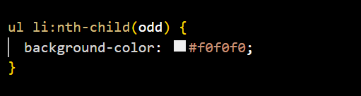
- Set colors, fonts, and sizes
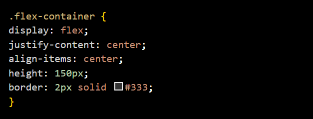
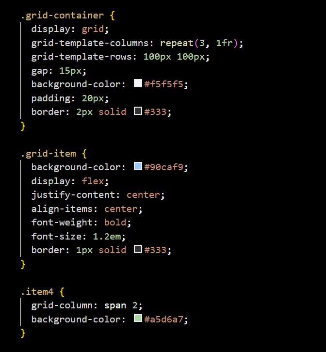
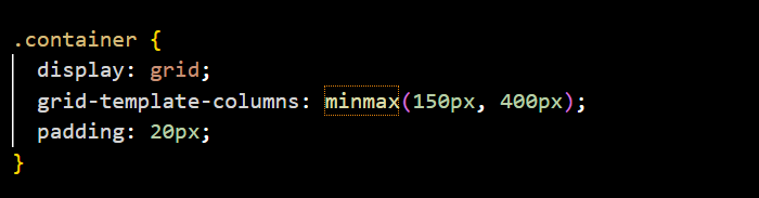
- Control layout (flexbox, grid, positioning)
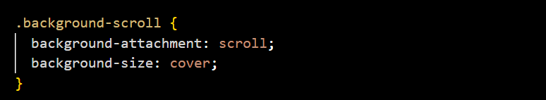
- Add borders, shadows, and backgrounds
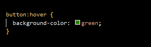
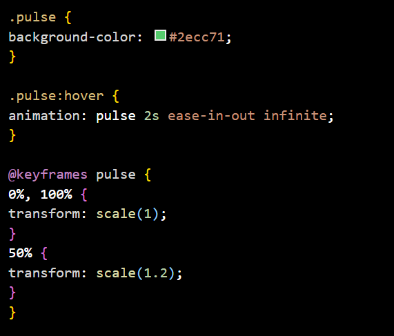
- Create transitions, animations, and hover effects
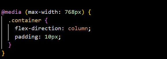
- Make sites responsive to different screen sizes
Why Is CSS Important?
- Separates content from design: HTML handles structure; CSS handles appearance.
- Improves reusability and maintainability: One CSS file can style multiple pages.
- Enables responsive design: CSS lets your website adapt to different screen sizes.
- Supports animations and transitions: You can create visual effects without JavaScript.
- Reduces code duplication: Write style rules once and apply them across elements.
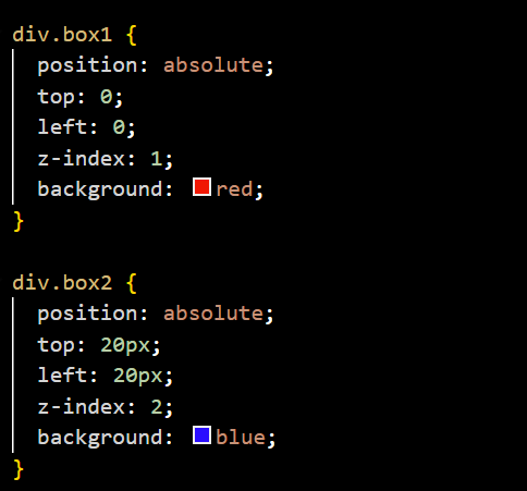
Understanding CSS Cascading
Cascading in CSS means that when multiple rules target the same element, the browser decides which one to apply based on priority. It follows three main principles:
- Specificity – More specific selectors win (e.g., #id beats .class)
- Source order – If specificity is the same, the last rule in the code wins.
- Importance – Rules marked with !important override most others.
For example, if two body selectors set different background colors, the one written later in the CSS will be applied—unless the earlier one has higher specificity or uses !important.
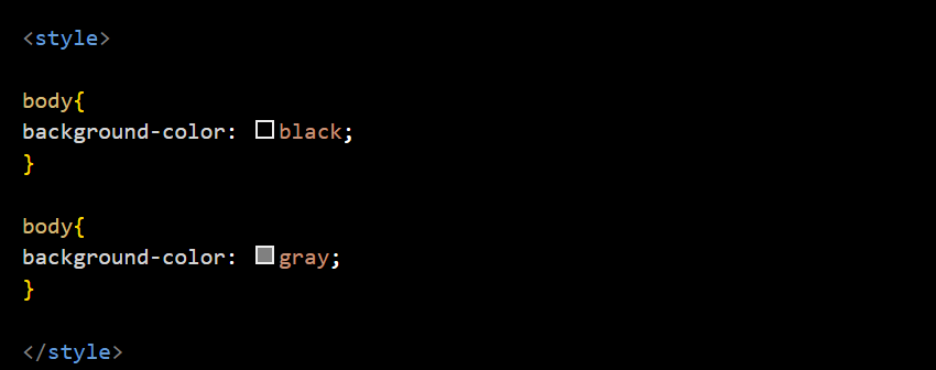
In the example below, the background will be gray because it’s the last rule applied to the selector. However, if we add "!important" to the black value, it will override the later rule, and the background will change to black.
Types of CSS: Inline, Internal, and External
CSS can be applied in three main ways: inline, internal, and external.
- Inline CSS is written directly in the HTML element using the style attribute, ideal for quick, single-use styles but not reusable.
- Internal CSS is placed within a style tag inside the head of the HTML document, making it suitable for styling a single page.
- External CSS is written in a separate .css file and linked to the HTML using a link tag, which is the best practice for larger websites because it's reusable, easier to maintain, and keeps style separate from structure.
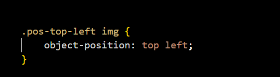
Note: To add Comments on CSS start with /* and end with */. They are ignored by the browser and are used to explain your code or leave notes.